 ...but not as if nothing happened!
Thursday, December 04, 2008
Social Sites, Laptops and Design Education
A row of empty studios greeted me.
It was as if the Christmas break had come early to my alma mater - the National Institute of Design (NID). The rows of studios were buzz of activity when I was a student there some dozen years ago. The open studios partitioned by plywood sheets of around 4 feet would be home to many throughout the day and often late into night.
Not any more, says Tarundeep Girdhar, my host and the co-ordinator of Graphic Design Studies at the NID. Remember the enlarger? A medieval device that would gobble us up as we entered its guts and tried to enlarge the drawings via a series of old-world reflections...
The studio was the hub of all activity - a place where we would draw, sketch, colour, cut, argue, review, critique. This was a place where revered (or hated) seniors would pass by, look over the partitions and offer insights, feedback and criticism. As would visiting faculty and the full timers. The drawing teacher could comment on logo design and vice-a-versa.
In the last week of November, I came to NID (after almost a decade) for the open juries - one of the evaluation method used to test students at the end of the semester. And by the end of day one, almost 9 hours of sitting through presentations - one thing was clear, there wasn't sufficient critiques happening on a weekly level. Context wasn't being clearly set for many of the theoretical briefs. Several student responses lacked the maturity or their very own perspectives that should reflect in the work of the particular year.
On day 2, it became evidently clear that far too many students were spending far too much time sitting in their rooms, glued to laptop screens, their interaction mediated by mobiles or sites like facebook. No wonder the studios were sparse. The revered, hated or even apathetic senior were missing as were wide-eyed wonder struck juniors. I had a chat with a group of students later that night, well past their dinner time. Most of the group seemed to agree with my observation - they were spending far little time in the studios chatting, arguing (and drawing/cuting and pasting in the real world in real time) and most importantly learning from each other and their peers. My furniture designer friends would have a point of view on the poster. Over cups of chai we would agree, or agree to disagree - and each would leave a little more enlightened (or corrected).
Real world interaction around a real printed or prototyped piece of work can not only help shape opinions and issues around the particular piece but also about design practice in a broader sense. Watching and participating in critiques is a surefire learning experience that stays well beyond the few hours that could be put in every week.
As I left Ahmedabad the following morning early, I couldn't help but think of all those who shaped my opinion about design - through examples of delightfully good, sheer bad and utterly ugly work. My classmates, the seniors, the many visitors who passed through and commented on work, the juniors and of course my teachers.
The challenge: how do we introduce the digitally connected generation to the real classroom and help them each find their own opinionated pathways through the richly layered world of design?
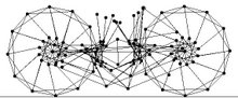
 Above: Student Yash Misra's visualisation of his social networks is a fascinating study into the multiple platforms via which students interact at NID.
A row of empty studios greeted me.
It was as if the Christmas break had come early to my alma mater - the National Institute of Design (NID). The rows of studios were buzz of activity when I was a student there some dozen years ago. The open studios partitioned by plywood sheets of around 4 feet would be home to many throughout the day and often late into night.
Not any more, says Tarundeep Girdhar, my host and the co-ordinator of Graphic Design Studies at the NID. Remember the enlarger? A medieval device that would gobble us up as we entered its guts and tried to enlarge the drawings via a series of old-world reflections...
The studio was the hub of all activity - a place where we would draw, sketch, colour, cut, argue, review, critique. This was a place where revered (or hated) seniors would pass by, look over the partitions and offer insights, feedback and criticism. As would visiting faculty and the full timers. The drawing teacher could comment on logo design and vice-a-versa.
In the last week of November, I came to NID (after almost a decade) for the open juries - one of the evaluation method used to test students at the end of the semester. And by the end of day one, almost 9 hours of sitting through presentations - one thing was clear, there wasn't sufficient critiques happening on a weekly level. Context wasn't being clearly set for many of the theoretical briefs. Several student responses lacked the maturity or their very own perspectives that should reflect in the work of the particular year.
On day 2, it became evidently clear that far too many students were spending far too much time sitting in their rooms, glued to laptop screens, their interaction mediated by mobiles or sites like facebook. No wonder the studios were sparse. The revered, hated or even apathetic senior were missing as were wide-eyed wonder struck juniors. I had a chat with a group of students later that night, well past their dinner time. Most of the group seemed to agree with my observation - they were spending far little time in the studios chatting, arguing (and drawing/cuting and pasting in the real world in real time) and most importantly learning from each other and their peers. My furniture designer friends would have a point of view on the poster. Over cups of chai we would agree, or agree to disagree - and each would leave a little more enlightened (or corrected).
Real world interaction around a real printed or prototyped piece of work can not only help shape opinions and issues around the particular piece but also about design practice in a broader sense. Watching and participating in critiques is a surefire learning experience that stays well beyond the few hours that could be put in every week.
As I left Ahmedabad the following morning early, I couldn't help but think of all those who shaped my opinion about design - through examples of delightfully good, sheer bad and utterly ugly work. My classmates, the seniors, the many visitors who passed through and commented on work, the juniors and of course my teachers.
The challenge: how do we introduce the digitally connected generation to the real classroom and help them each find their own opinionated pathways through the richly layered world of design?
 Above: Student Yash Misra's visualisation of his social networks is a fascinating study into the multiple platforms via which students interact at NID.
Monday, December 01, 2008
Every end is a beginning...
What better way to restart the blog then begin with the end. Not just 'the end' but multiple ends. A selection from Dill Pixels' magnificent collection...

What better way to restart the blog then begin with the end. Not just 'the end' but multiple ends. A selection from Dill Pixels' magnificent collection...

Monday, July 21, 2008

Friday, July 18, 2008
The Brand Creature
Brand consultants are famous for asking those bog standard questions that define brand personality: If your brand was a watch...what would it be? Or What car would it be? Or if it were an animal what would it be? Designer Corey Holmes' taxonomy turns the question on its head....absolutely fab...

Brand consultants are famous for asking those bog standard questions that define brand personality: If your brand was a watch...what would it be? Or What car would it be? Or if it were an animal what would it be? Designer Corey Holmes' taxonomy turns the question on its head....absolutely fab...
Thursday, July 03, 2008
Banking on listening to your customers
A recent letter seems to be doing the rounds on the internet - its author is allegedly a 96 year old unhappy soul, who, despite her age, seems to be as sharp as Edward Deming crossed with your earnest engineering grad. And with a great sense of humor. The reason for the letter is: "to thank you (the Bank Manager) for bouncing my check with which I endeavored to pay my plumber with last month. By my calculations, three nanoseconds must have elapsed between his presenting the check and the arrival in my account of the funds needed to honor it.

A recent letter seems to be doing the rounds on the internet - its author is allegedly a 96 year old unhappy soul, who, despite her age, seems to be as sharp as Edward Deming crossed with your earnest engineering grad. And with a great sense of humor. The reason for the letter is: "to thank you (the Bank Manager) for bouncing my check with which I endeavored to pay my plumber with last month. By my calculations, three nanoseconds must have elapsed between his presenting the check and the arrival in my account of the funds needed to honor it.
I refer, of course, to the automatic monthly deposit of my entire salary, an arrangement which, I admit, has been in place for only eight years. You are to be commended for seizing that brief window of opportunity, and also for debiting my account $30 by way of penalty for the inconvenience caused to your bank." And the solution is ingenious:
"In due course, I will issue your (Bank's) employee with a PIN number which he/she must quote in dealings with me. I regret that it cann ot be shorter than 28 digits but, again, I have modeled it on the number of button presses required of me to access my account balance on your phone bank service. As they say, imitation is the sincerest form of flattery.
Let me level the playing field even further. When you call me, press buttons as follows:
1. To make an appointment to see me
2. To query a missing payment.
3. To transfer the call to my living room in case I am there.
4. To transfer the call to my bedroom in case I am sleeping.
5. To transfer the call to my toilet in case I am attending to nature.
6. To transfer the call to my mobile phone if I am not at home
7. To leave a message on my computer, a password to access my computer is required. Password will be communicated to you at a later date to the Authorized Contact.
8. To return to the main menu and to listen to options 1 through 7.
9. To make a general complaint or inquiry. The contact will then be put on hold, pending the attention of my automated answering service. While this may, on occasion, involve a lengthy wait, uplifting music will play for the duration of the call." Click here to read the complete letter.
Obviously it isn't real (I mean the 96 year old woman story) - it was written by a Peter Wear a columnist for Brisbane's Courier Mail and inspired by an incident of his cheque bouncing. This was 1999 but many brands and businesses even today fail to answer the simple core question: "who do we exist for?" IBM of course has a brilliant campaign that drives home the point, less eloquently than Mr Wear, but spot-on nonetheless...
There is more to Bangalore
than just IT
In its June 28th edition, The Bangalore Mirror lists 10 interesting organisations that the city is know for other than the usual big IT names that its famous for like Wipro, Infosys, TCS, HP, IBM et al. The list features US Pizza, The Himalaya Drug Co., Avesthagen, Cafe Coffee Day and Ray+Keshavan.
In its June 28th edition, The Bangalore Mirror lists 10 interesting organisations that the city is know for other than the usual big IT names that its famous for like Wipro, Infosys, TCS, HP, IBM et al. The list features US Pizza, The Himalaya Drug Co., Avesthagen, Cafe Coffee Day and Ray+Keshavan.
Wednesday, July 02, 2008
The journey of the BIAL brand mark


Looking through my collection of hard-to-decipher file names, I came across this interesting little travelogue (below) - albeit in a visual form. The journey of the BIAL mark - from a sketch on the back of an envelope to a recognised marque. A good companion to my earlier rambling on the BIAL identity—therefore this post.

Most journeys for a brand creation or transformation are often seen one fine morning in the local newspaper or on blogs frequented by brandistas like me and my colleagues, or on one those hate-forums of designers that feel that they could have added far more worth and value.
After all design and branding are a profession that are subject to extremes of subjectivism and open to criticism of the n-th degree. The objectivity that one can bring to the subject is the context (which in case of this particular logo was centred around an airport for the city of bangalore); production issues/constraints and long term strategic intent (in this case BIA wanted to get connect better with the city - else they already had a logo). Most skirt around the third issue conveniently - but it is often the most critical trigger for a brand change. BIA ceo Albert Brunner and his team took a strategic decision of opting for a fresh new mark instead of the corporate mark (with multiple arrows) which had no geographical connect.
As the little road map above shows - many objective decisions shaped the final identity, as did several subjective opinions too. Several worth logos made it to the quarter-finals and sem-finals. Some dropped due to subjective preferences and many due to a lack of fit with strategic intent. My European biased colour palette was finally injected with a riot of tropical hues by my many wonderful colleagues, the dots were dropped, the type became stronger, the forms became sharper - perfectly fit for production, legibility and readability. The pleasing part was the partnership that was forged between the client, stakeholders and consultant teams to define what was right and relevant for the airport brand - not was was 'good' or what 'I like' or what 'my son or grandchild loves'.

Wednesday, April 16, 2008
 A Brand New Airport
While I was still deliberating joining R+K, Sujata Keshavan (R+K | Brand Union MD) mentioned to me that we might be doing the Bangalore International Airport Identity. It was a fantastic piece of news I thought - after all you don't get to do an Airport identity every other day. Its a once in a career opportunity - or as it was to prove with my first year at The Brand Union - twice in a year one. My first interaction with the Bangalore Airport (the old one along Airpot Road en route to Whitefield) was a complete disappointment. It was a chaotic, overcrowded terminal - the outside was no more reassuring - neither was the traffic on the arterial roads. My memories of Bangalore were of a city in the ago when the Airport was pretty much on the outer fringes. Over a period of time as I began to accept the city as it was - I began to find other facets. The flowers on my windscreen, a number of roads where the trees criss-crossed and hid the skies, the changing colours in the misdt of greens - bright orange, flaming reds, soft lilacs, pinks and whites.
We had already started the work on the Airport logo by then, emphasizing that the identity must connect the airort to the city, just as the airport would connect the city to the world outside. A number of routes were explored, hundreds of sketches revised, redrawn and reviewed. The crossroads of in our approach ws at the juncture of the old and the new. Should we look at a youthful, vibrant Bangalore - India's Silicon Valley or the timeless city of mild weather and gardens?
We opted for the latter, supported by the views of Bangaloreans both young and old, the ones that would frequent the new Airport and the ones who would possibly watch from a distance, until someday they to were passengers. Our choice was ratified by a number of articles in media (around end of 2007), questioning the good that sudden implantation of western MNCs had bought to cities like Bangalore - questioning if all citizens of the new Silicon Valley were indeed happy on the newly acquired status. The answer, the articles suggested, were a clear negation.
The Garden city route was the preferred one, after all Bangalore was better known for its various parks and gardens (and lakes or kere) than its monuments (some of them fairly recent in comparison to its Parks). The current logo, in different hues, made it to the shortlist. And then to the next round and the one after. My colleagues changed the colours, refined the forms and redefined the transparency. The clients voted overwhelmingly for this option (they could have retained an existing marque but didn't). It was a journey of over 7 months, a journey marked by learning and discovery - of losing and finidng a city that many of us now call home.
 The graceful, soft forms hints at the act of air travel - of converging and again of flying outwards. The colours are vibrant, the overlap emphasizes the rich tapestry that is a multi-cultural cosmopolitan city such as Bangalore. The colours of the logo are meant reflect the natural environs - the bright hues of the flowers, the softer teal green that represents both water and greens - leaves and grass. The symbol hovers above the typography like a hummingbird in perfect balance. The decision to put in the words Bengaluru instead of Bangalore was in a sense, to pay tribute to its founding fathers - to uncover its roots and be proud of it, whilst being contemporary, responsive and modern in every other aspect. The abridged BLR still holds as good.
Seen against a number of Airport logos that with the city-connect the Bangalore Airport logo is fresh and distinctive - its colours typically Indian - a free, festive spirit, reflecting the spirit of Bangalore.
Thursday, January 17, 2008

New year, new event...
Its been close to a year since I last wrote on Blogspot. My last post stands roughly 12 days away from the 365 that make up a year. And what a year it has been. The move from Manchester to Bangalore via so many accidents, incidents, worries and apprehensions, triumphs and adjustments. Its been a year of great and drastic change - some for the better, some for the worse. So what made me revisit blogspot and write again?
I am wondering - is it because tomorrow we launch the first Indian preselections for the Webdesign International Festival 08. The posters have been done, the T-shirts are being printed, the invitations sent out - not the ones for the press. We have decided to hold them back - it may have meant a bit of chaos once the brief was read out and the teams scrambled for ideas and action.
The posters were addictive - after a long time I sat down and did something that I couldn't move away from. No client constraints, no brand guidelines. Time was running out as usual - but in someways it froze as I worked across the type, the leading and kerning - the images, the lines. It was a fluid, quick series of motions transforming a blank canvas into a live piece of work. I am sure Pooja enjoyed working on her posters as much as I did. Tomorrow comes the big day, and Aude and the 12 teams. More then.
Subscribe to:
Posts (Atom)
thanks for stopping by...