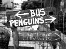
Few websites can claim to have the brevity of a Google's home page - Google's minimalism is packed with performance and high on the popularity list. The Remember Segregation home page beats Google's minimalism - it's home page is home to merely four words - and yet the idea is effective, powerful and potent:

Remember Segregation remembers the legacy of Martin Luther King Jr. and other illustrous figures from all walks of life who fought to make segregation history — in the US. The textured background, the grayscale images, the Grotesk and serif typefaces - all contribute to give it the look of archived material but not exactly dated. After all segregation didn't exactly end centuries ago.
I remember an Advert from my student days that eloquently put events into historical perspective. The full page advert (I can't remember who designed/wrote it) had the image of Neil Amstrong stepping out into the Lunar landscape - the headline below read: "And a year later black Americans could vote".
The "Remember...' site itself has this sense of serenity - of peaceful 'reconciliation' a term I found being generously used in South Africa - a coming to terms with the past and of moving on.
 You may not notice the lack of colour on the site - the shades of black interplay with the tones of white - a hint of sepia in the gallery and the warm grey of the background. The minimal palette does aid a minimal but effective menu system, clearly laid out and demarcated by 3 horizontal lines.
I am reminded of Steve Krug (I had the good fortune of working in the same organisation as him) and his wonderful book - Don't Make Me Think. For those who haven't laid their eyes on the inside pages yet - the book simply demonstrates how clear and highly usable sites can be built with a big dose of commonsense and an simpler principle - let not thy visitor fret or fume or try and make sense of what the site is or where to go and how. In line with Krug's advice, the RS site is clear and it is highly unlikely that you will struggle with the navigational basics.
Although, site may be visually quiet - almost mild mannered and softly spoken - but its message is powerful. It is the that content makes you think. Spelled out loud and clear, lingering on long after you have closed your browser window.

As I write this - in one part of the world Martin Luther King Jr's birthday is being celebrated while in another part, over 20,000 complaints are pouring in on alleged racial discrimination/abuse on a (popular) reality TV show.


3 comments:
Great recommendation - the mention of Steve's book (a personal fav) is relevant. And you are right that though the 'serene' layout does not make you ponder and tear your head in frustration - the content is king and makes you really think.
Jay,
Keep up the blog, it’s a regular window for me.
As a mechanical designer in the ‘disability access market’ I am particularly interest in Stannah’s recently launched awareness/advertising campaign.
The links on this page cover the visual aspects: http://www.stannahstairlifts.co.uk/site/news_list_detail.asp?news=378
I’d be interested to hear your impressions, if you have time.
Regards
Derek Johnson
People should read this.
Post a Comment