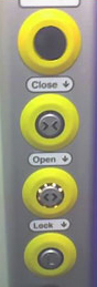
Tuesday, December 19, 2006

Person of the Year: You

Time's cover uses a print gimmick: sleek, shiny metalic print - emulating a mirror like surface and reflecting you - the reader.

Time has decided to give its person of the Year award to you. And you and you. All of those those millions of people who are the powerhouse behined what is commonly referred to as 'Web 2.0'. Web 2.0 is a leap in technology and a leap in terms of the way that users like you and me relate, create and co-create content. The notion of DIY webstuff, the non-famous, non-celebrity, man and woman on the street as author, film-maker, designer is not a new notion, but possibly has seen a definitive peak in 2006.

Phil Korbel, director of Regen Radio - says its too much 'me, me, me' out there. Well, after all the word media starts with a me and now the technology actually allows me to quickly, easily publishin to a global audience. The notion of brands as conversations is neither new - brands, besides their logotypes, products etc, exist primarily in the minds and conversations of individuals - the word of mouth (or now blogs) propagates it. Myths, rituals, stories position the brands firmly in our mindsets. Horror stories from our neighbour can make it fall off our mental map.

And then there was the Cluetrain Manifesto as old as 2000 which spoke of powerful global conversations, initiated and created by you and me. If you haven't read it yet - its worth a visit and read. The core message: markets are conversations. And in the cyberspace - as much as in real life, culture is conversation too - not just words, but pictures, sounds and moving images. Which we co-create.

Monday, December 11, 2006

Mashup Man

By day Amit Gupta is a busy, mild mannered (my guess) IT manager of a Fortune 100 corporation. In his spare time Amit transforms into a super mashupman - ideator and coder of the E41St that has won him a xBox 360 and jury's acclaim - a place in the annals of the Adobe Flex and of course praise and the big 'wow' from users (and bibliophiles) like me.

When looking for my RSA library books over the internet, or my audio books on Audible, my search reveals a long list. Sometimes I am looking for a specific book and often I am looking for a surprise discovery. A few new titles are interesting, or authors I have heard of - and so to check out what other readers are saying, I head off to two more browser windows and internet sites: amazon.co.uk and amazon.com

This is what countless others do as well - the difference being that Amit decided to put his skills to good use and combine all info in one place. There was a challenge in form of the Adobe Flex Developer Derby, a carrot in form of the xBox 360 and the love of books. In 30 days the E41St was up, built in Adobe Flex (Amit's first brush with Flex). However he commends Adobe for "keeping the ActionScript syntax similar to C/C++/C#/JavaScript/etc and providing samples & documentation. Surely, a seasoned Flash/Flex developer could have designed the app's internals better than me, but for my purposes, the desired outcome was achieved quickly". Flex could well be called the next Gen of Flash - delivering RIA - Rich Internet Applications and experiences.


E41St is named after NewYork's Library Street and the site marries the online catalogue of your own library with user reviews from Amazon. A true mash-up since the richness of the site does not lie in it's database - but in its dexterity to combine and communicate two distinctive, but useful sets of information. And save your choices in your virtual online bookshelf. The site is work-in-progress, changes are being incorporated everday (my request to add RSA London is one of the many).

The site is clean and simple, incorporates AJAX elements and is quite intuitive to use (I shall not go into a detailed discussion here). The clear hierarchy of categories and sub-categories leads to the right panel with a visual display of title pages. A great treat for many designers. And you can keep searching for more. Its like a search along the x and y axis - with some interesting surprises along the way. Then there is your own bookshelf and if you are in the USA, you may find your own library there as well. E41St is worth a visit - and I am sure your comments and feedback will help Amit make his site better - or simply incorporate your library.

Its interesting that users like you, me and Amit can create or contribute to creating sites that can match brands and corporations in terms of size, reach or usefulness - a true media democracy. Marx would have been a happy man for the tools of production have been truly claimed by the workers themselves.

For more details about AJAX, RIA and Flex just run down to the list of the tech links on the right column.

Saturday, December 02, 2006

Bending Light

A magazine, a website and more importantly an inspiration, Bending Light draws upon submissions (around a theme) from enthusiasts and professionals and compiles its periodical flashzine. Though its not a DIY site like Flickr, the website is indeed a testament to media democratisation - the non-professional's opportunity to showcase their talents. Sunrise over the Pagodas in Bagan, Burma, by German Geophysicist David Haberlah is one of the many interesting takes on our rich, diverse world. The flash mag itself is an excellent example of clean, uncluttered design with thoughtful functionality. The site necessiates a visit (and a bookmark) - and I must let the pictures do the talking. After all a picture is worth a thousand word.

Wednesday, November 29, 2006

"Know thy customer"

I met the cheerful elderly man in the corridor of the London bound Virgin Pendolino train. He must have been close to 70, or maybe 70+ (I am not particularly good at guessing people's age). He had been advising another elderly lady on the perils of being trapped in train's disabled toilets - or worse, to suffer the embarassment of not having pushed the right button to lock the door. Seeing me - he shrugged his shoulders and expressed his inability to understand the 'ways' of the new world of laptops, shuffles, mice and sliding doors.

I could see his point perfectly - pushing a similar set of buttons to do dissimilar things didn't make sense to man who was used to closing a door with a handle (or knob) and locking with keys. Shapes communicated purpose - or function. In the electronic/digital world, it wasn't shapes - but symbols that communicated function. The buttons were all the same.

We both agreed it was to make the toilet 'accessible' to people who might not have the same ability as many of us to push, pull, twist etc. However - this set of buttons had made it inaccessible to some users. The law of Unintended Consequences. Would colours (the thick rings) have helped - stereotypes like red, amber and green?

He was however, genuinely surprised with one brand though. A brand called Saga. He called to renew his car insurance - when the voice answered his call, he fumbled for a number to press (maybe he hadn't heard the instructions: "press 1 for...") - he was reassured to hear an actual person at the end of the line. His insurance requests were actioned in less than the full 6 minutes.

Saga follows Prof. Porter's directive to the T - "stick to a niche". Saga serves the 50 year+ market and obviously knows what makes them tick. Saga itself has been around for well over 50 years and possibly is know better for its cruises/holidays for the age group. Apart from its holidays and insurance business, Saga also has a magazine, a search facility online to find old/new friends and a radio station. IA-Centre has an interesting case study on the Saga105.2FM.

Like my fellow traveller in the corridor - Saga has possibly managed to delight thousands of other elderly customers in a world where marketing and advertising are increasingly youth oriented. 
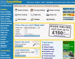
Saga's website has an over-emphasis on text - and may be fine for some of the 'readers' that scans the pages and reads it aloud to visually impaired. Though there is no indications or marks of its ccessibility credentials (those rows of neat logos at the bottom or a visible accessibility link on the home page itself). Very strangely, its home page and the second level looks distinctively different - I mean the buttons are different, the menu items on the left look different - almost everything apart from the colour. Saga's travelshop is different too and every possible pixel is covered by a rectangle of some size or a border - and I wonder what my fellow traveller would make of these.

Like the Pink PSP I wrote about earlier, Saga seems to have developed some new peripheral (and add-on) services/products for a niche market. However, like Dodge - their excellence in one area can be undermined by the lack of brand unity - in another area. The message for brand owners is simple - regular routine audits is the key (one of my former clients, Goldfish - was a master of this) as well as to avoid the temptation of adding too many features/buttons and links on their communication pieces. And of course - keeping in touch with what the customers think. Simple? Thats just the tip of the iceberg... [Virgin train image courtsey Yappari.co.uk]

Sunday, November 26, 2006

Ploughing on...

My last post dwelled on the Fiat spreading its brand values too thin - and of some of the emails I have had from you, including one of my former students pointed me to the Dodge Nitro 'planet' advert. And my good old academic instinct of 'compare and contrast' finds the perfect springboard. Dodge and Fiat. Its all about cars - but these two brands are worlds apart.


Dodge knows it customers - and in every generation there are customers who seek out their Dodge machines. Dodge leverages on its military tradition - being suppliers of 'tough' vehicles to the army. Many of the customers know that these cars have nothing to do with the Dodge family - the brothers sold the company in 1925 and after several mergers and acquisitions, its currently part of the Diamler-Benz stables, who in turn have carefully kept the brand distinctive and as undiluted as it possibly could.

Some of you (esp the B-Schools types) may recall Prof. Porter's theory of Competitive Advantage - its either differentiation or cost leadership - or the third, a tricky path, is to focus on a certain segment while maintaining cost leadership. The Professor warns of a certain consequence of not following either - "stuck in the middle"! Does that describe Fiat? And can its new logo, revisiting the past, et al help it come unstuck? Dodge, in the meantime keeps ploughing on - its entrenched itself into a position that seems like home. Environmentally friendly, it isn't - and it isn't trying to be. Not as yet. Ploughing through the depths of the earth, knocking a few of those extinct creatures unconscious, isn't really much of a bother for the head strong brand.

Unlike the Dodge advert, the Dodge website - while being informative (and ever so slightly overloaded), lacks the imaginative touch or the creative spark of its adverts - or any ability to bridge the wide gap between media campaign and online communication.

Monday, November 20, 2006

Fiat's brand mojo

Ambling along the 20mph speed on a Monday morning rush hour you can't help but notice the interesting number of marques, badges and names on the various cars. This morning I seemed to be in the midst of VWs, Fords and Mercs (who isn't) and Fiats. Interestingly, if you have noticed you may see a number of different Fiat badges or marques - quite unlike, lets say, a VW or a Merc. Look at VW or Merc registered in the early 1985s or this year. The 85 model looks dated, the curves aren't as elegant as the ones today, the grills are plasticky, the colours lack the sheen. Lets face it the 1985s model isn't exactly new. But notice the VW badge. It will be in the same place, it will be the same size - almost. And if you look into the Think Small ads, its the same for the B&W beetle advertised in another generation.


Not Fiat.

On any day you will see a few distinctive marques - the italic capitals FIAT, reminiscent of the BBC (top right, logo from 1968-2003), the one with the wreaths - which looks straight from the early 1900s (bottom left, 2003-2006) or you might even come across the recently unveiled logo - reflecting "Fiat's new strategy". Fiat has a heritage of a good dozen or so logos, sometime lasting a mere few years (like the top left logo from 1901). Though many sites talk of Fiat's new strategy - few spell out the relationship between the new logo (bottom right) and the new strategy.

Therein lies the paradox...

The new logo predates the capitalised italics logo - and according to Fiat's site: "is a basic, strong logo that sums up in the best possible way this ongoing change that distinguishes Fiat today. A company travelling into the future which is, at the same time, proud of its historic identity." As car manufacturers move across horizontally and vertically - in search of new markets and new customers they are at risk of diluting their core brand values and propositions. When you begin to mean a lot of things to a lot of people, you often do not stand for something - but end up being commoditised for the masses. Is this what Fiat means when it says "to move forward you sometimes need to take a step in the other direction." Can logos truly change the culture and nature of the company or do companies and their internal change actually add a distinctive meaning to their existing logos?

Lets wait and watch if the new logo can help Fiat find its brand mojo...

Tuesday, November 14, 2006

Another Pink wash...


I was quite surprised to see the Pink PSP adverts in the bus shelters. Though I shouldn't be. Cars are appearing in shades of pink and so are phones and many other electronic gadgets. This has been the marketing 'make-up' mantra of the not-so-creative variety. A veneer of pink may help some products fly off the shelf - but Pink PSPs?

Allow me to expand on that - Games and gaming seem to be the domain of males. The players are males (a decent 85% if stats are to be belived), the game scenarios are designed for males and predominantly by males. I have yet to come across a serious female game player - essentially because games are designed to be bloody (or blood thirsty) - lack adequate attention to detailing characters (or developing them) or a strong narrative. The fights, blood and gore often substitutes for storylines or characters. Games are symbolic of gender stereotyping.

Should games be for men or women - commonsense suggest otherwise. I am sure that there is a healthy middle ground or a gender neutral scenario. Or more female game designers. A shallow Pink-wash simply isn't the solution.

A quick search over the net led me to a Wired.com article by Janelle Brown - Girl Gamers, written on 19 Nov. 1996 - almost exactly 10 years ago. Little seems to have changed apart from the skins on PSPs. And will the Girl gamers who compete with the boys on equal level, trade in their Black PSPs for the Pink ones? Or is it an optimistic illusion of some of Sony's bright marketing/sales execs? Lets keep an eye out for the latest pink Phenomenon...

Also see: The Girl Gamer's Manifesto

Monday, November 13, 2006

Sales versus Design?

The debate was getting emotional and charged. One side represented by the evergreen salesman - DR and the other side by yours truly. "Nothing happens until you sell it" - is DR's contention. "Good design can only make the sales process easier - it sells itself", I add pointing to the iPod. Can you imagine a door-to-door salesmen touting iPods or telesales agents calling up with deals?

Or think of time when the 'think small' advert became etched in a generation's minds. That may have driven a decent number to the VW dealership - though I have no idea what is the ratio of people who saw the adverts to the those who made the final purchase. A good few decades later the brand is still etched in the collective consciousness.

"Selling is equally creative" adds DR. I think creativity is an attitude - anything can be approached in a creative, inventive or child-like manner: as if seeing it for the first time and bringing a fresh pair of eyes, ears or head, to the issue. As long as one isn't creative with numbers, even accounting problems can be approached with a creative hat.

"What about the John Abraham's Flu Relief Lozenges?", quips in DR. I am sure design can help it sell better, possibly not faster. Though we must always remember that good design can merely make a bad product fail faster. I don't disagree with DR on the issue of selling - "until it's sold nothing happens" - but the process, structure, routine and ritual of sales are widely varying - and more often given a bad reputation by those who are out to make a quick buck. Perhaps I can get across the point that design is about enhancing desireability of a product or service, thereby making it more 'sale-able'. Or perhaps DR knows already.

Sunday, November 12, 2006

Of Cabbages and Kings, my original and the longest surviving of blogs (a record month with a post almost every week) isn't exactly dead. As the name suggests - the subject area of the blog was rather wide - ranging from Type navigators to London Underground. Nothing wrong about that you may say, but it certainly lacks a certain focus - and thats what I intend to do in this blog.

A deep dive, without casting the net too wide - is the intention here. There will be the usual and occassional posting on the C&Kings blog - but again for topics that are wide off the margins and the columns.

Key question is if I can make a habit of transferring those random notes, thoughts and observations from my sketchbooks, my palm, my diary and (more importantly) from my head on to this public domain? Thoughts on Design, branding, design management and brand stickiness.

Let me give it a good earnest shot...

thanks for stopping by...

thanks for stopping by...